Cycling Kit Design and Branding: From the Logo You Have to a File That Prints
You already have the logo, the sponsors and the roster. What you probably don't have is the version of them that survives being printed on stretch fabric and read from ten metres behind. That part is ours.
Send Your Logo and Colour ReferencesThe logo in whatever state it is in, your colour references, and the roster if there is one. A tech pack if you have one; if you don't, that is a normal place to start.
A vector redraw, a placement layout you sign off on, a physical sample against your colour reference, and the confirmed files kept on file for the next order.
Before you send
Most Team Logos Were Never Drawn With Fabric in Mind
That is not a problem, it is the normal starting condition. But it does mean the first job is a translation, and it helps to know what is being translated into what.
A club logo usually starts life on a website header, a social avatar or a printed flyer. All three are places where a 900-pixel-wide file looks perfect. A jersey back panel is not one of those places: it is a curved, stretching surface that will be looked at from behind at speed, and it wants the artwork described as shapes, not as pixels.
So the first thing we do with whatever you send is establish which of four states it is in — because each state has a different amount of work in front of it, and you deserve to know that before you commit to anything.
The Four States Artwork Arrives In
| What you send | What we can do with it as-is | What it has to become before cutting |
|---|---|---|
| A vector file (outlines, editable) | Place it, scale it, recolour it, separate it by decoration method | Almost nothing — we check that type is converted to outlines and that colours are named |
| A high-resolution raster (a large, clean PNG or TIFF) | Judge the shapes accurately; place it provisionally | A redraw as outlines, so it holds at any size on any panel |
| A low-resolution raster (a small or soft PNG, a screenshot, a flyer scan) | Read the intent — proportions, weights, which element is dominant | A redraw, plus a written note of every judgement call we had to make on your behalf |
| A photograph or a sketch (a phone photo of an old kit, a hand drawing) | Identify the elements and their hierarchy | A redraw from scratch, and a round of confirmation before anything else proceeds |
The honest bit about the bottom two rows. Rebuilding a logo from a soft file or a photo means someone here decides how sharp a corner was meant to be, how heavy a stroke was meant to sit, and whether two shapes were meant to touch. Those are your brand's decisions, not ours.
So every redraw comes back to you with the judgement calls listed, not just as a tidy file and a cheerful message. If we guessed wrong on the shoulder of a letter, you find that out at the drawing stage and not on a rack of finished jerseys.
And what we won't pretend. A redraw is a rebuild, not a recovery. If the only surviving artwork is a photo of a fifteen-year-old jersey taken in bad light, the result will be a clean version of what we could read, and there will be one or two places where we ask you to choose rather than us assume.
Where things go
Six Places a Logo Can Go, and What Each Place Will Not Tolerate
A kit has six zones that sponsors actually ask for. They are not interchangeable, and the reason is physical: each one stretches differently, gets covered by something different, and is read from a different distance.
Sponsors ask for the back panel. Almost always, and usually all of them at once. So that is the zone worth spending your reading time on, and the other five can be described in a line each.
| Zone | What it will not tolerate | What tends to cover it |
|---|---|---|
| Back panel (main) | Fine strokes, tight letter spacing, anything that assumes a flat surface | A race number, a hydration pack, a jacket |
| Chest (front) | Wide artwork — the zip splits it, and a zip is never exactly central under load | A partly-open jersey, a bib strap under a base layer |
| Sleeve | Anything taller than the sleeve is deep; it wraps and reads as a curve | Arm warmers, a jacket cuff |
| Side panel | Detail — this is the most stretched surface on the garment | An elbow at speed, a hand on the hoods |
| Lower back pocket | Small type; the pocket is a double layer and it sags when loaded | Whatever is in the pocket |
| Collar / neck rear | Anything that needs to be read; it is a 30mm strip | A helmet strap, a collar folded under a jacket |
The Back Panel, In Detail — Because This Is Where Kit Projects Actually Get Stuck
The back panel is the largest single area on a jersey and also the least stable one. Six things act on it at once, and a placement decision that ignores any of them looks fine on a flat mockup and wrong on a rider.
- It stretches, and not evenly. Across the shoulder blades the fabric grows most; down the spine it grows least. Artwork that spans the full width will be wider at the top than the bottom once it is on a back that is rotated forward. So we keep sponsor artwork inside the stable band rather than spanning the full panel, and where a sponsor insists on full width we tell them what that will look like before it is printed rather than after.
- It carries load. The shoulder seam and the upper back take the pull of the arms reaching forward. A logo placed across that line gets a permanent crease running through it. Nothing important crosses the shoulder seam. That is a hard rule here, and it is the single most common change we make to artwork that arrives already laid out.
- It gets covered. A pinned race number sits centre-back, low. A hydration pack strap sits centre-back, vertical. If your event pins numbers, the lower-centre third of the back panel is not available, whatever the layout says — and the honest thing to do is move the sponsor rather than let them pay for a covered position.
- It is read from behind, at distance, by someone working hard. That is the actual viewing condition — not a flat image on a screen at arm's length. Type that reads cleanly at 400% on your monitor can be illegible from the wheel behind. We judge back-panel type at the distance it will be read from, and we will tell you when a name is too long for the space at a weight that survives it.
- Decoration sets a floor on how small anything can go. Each decoration method has a size below which a stroke stops being a stroke — full-width sublimation holds fine detail best, embroidery needs the most room, and a reflective element needs more still. The design decision here is which method carries which element, and it changes the layout. How each method works is on Printing Methods; this page only covers how the choice constrains where things go.
- Several sponsors need an order, and it has to be decided by you. Two logos at equal size on one panel read as equal partners. If your title sponsor is paying differently from your kit sponsor, that has to show up as a size and position hierarchy.
The one thing on this page that only you can decide. We will not invent a sponsor hierarchy. We lay out the zone with the order you give us; where you haven't given one, we send back a layout with the question marked on it rather than a guess quietly baked in.
Three Things This Section Deliberately Does Not Cover
- The gravel event case. On one regional gravel event's kit, a sponsor position was added late in the design stage and the delivery date held. That order belongs to Custom Gravel Cycling Apparel.
- Approval timing. When multiple parties have to approve artwork before a fixed event date — and what happens if one of them is late — is on Cycling Events and Corporate Orders. This page is about where things go once the approvals are in.
- Why the seam is where it is. How riding posture drives the pattern is on Riding Fit and Pattern Development. The load and stretch notes above are working judgements from the sewing floor, not posture research — we do not hold rider posture data and we do not produce body heat-zone maps.
Locked once
Your Team Colour Gets Fixed Once, and Every Later Order Reads From That File
The expensive version of a colour problem is not the first order. It is the third one, eighteen months later, next to a jersey from the first.
Colour is the one part of a kit project where everybody agrees early and nobody writes it down. A screenshot gets approved in a group chat, the season runs, and the reorder is compared against a garment that has been washed thirty times.
So we do two things at the design stage, and both of them produce an object or a file that outlives the conversation.
Two Confirmations, Both Ways
- You give us a colour reference. Whatever form it is in — values from your brand guidelines, a printed piece, a garment from a previous season. We work from what you have rather than asking you to produce something you don't.
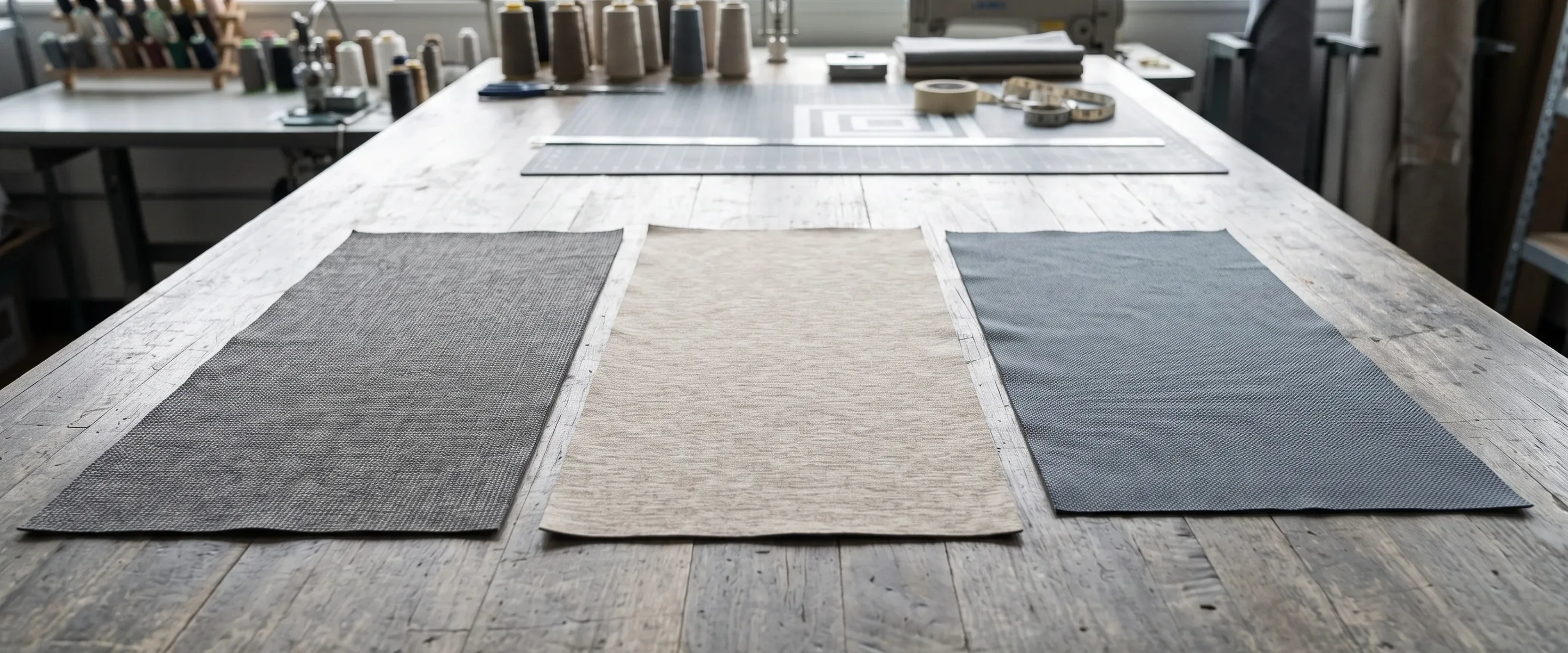
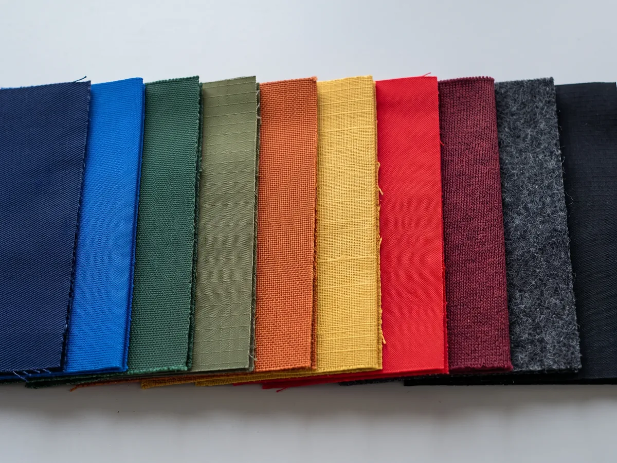
- We send back a physical colour reference on your actual fabric. This is the one that matters. A colour on a backlit screen and the same colour on a matte stretch knit are not the same experience, and the only honest way to agree on it is on the cloth we would cut yours from.
- You confirm against the physical piece, not the screen. Once that is signed off, that reference is what production is checked against — not the original screenshot.
What Gets Kept, and What That Buys You Next Season
Confirmed colour references are filed with your pattern and spec sheet after the order ships, by buyer and by style. A reorder or a new colourway starts from the confirmed file rather than from a fresh conversation — which is the whole point of writing it down in the first place. Where the file ownership sits, and what we will and won't do with it, is in its own section further down.
What we don't claim here, on purpose. We don't quote a colour-difference figure, and we don't hold instrument colour measurement reports. A number we can't hand you a report for is a number you would be right not to trust — and it is exactly the kind of claim a buyer can check on the day the goods land.
What you get instead is the physical reference in your hand, which is a slower promise and a checkable one. We also don't work from, or name, any third-party proprietary colour system. Your values and your physical reference are the two things on file.
Have the Logo and the Colours? That Is Enough to Start.
Send What You Have Send what you have and we will tell you which of the four states it is in, and what that means for the layout.Three separate items
The Label Is the Part People Forget Until the Sample Arrives Without One
Three separate items, three separate decisions, and none of them are part of the jersey artwork.
Kit artwork gets weeks of attention. Labels get remembered at sampling, which is late. They matter more than that suggests, because for a club they are the difference between a kit and a product, and for a brand they are the entire difference between a private-label garment and a blank one.
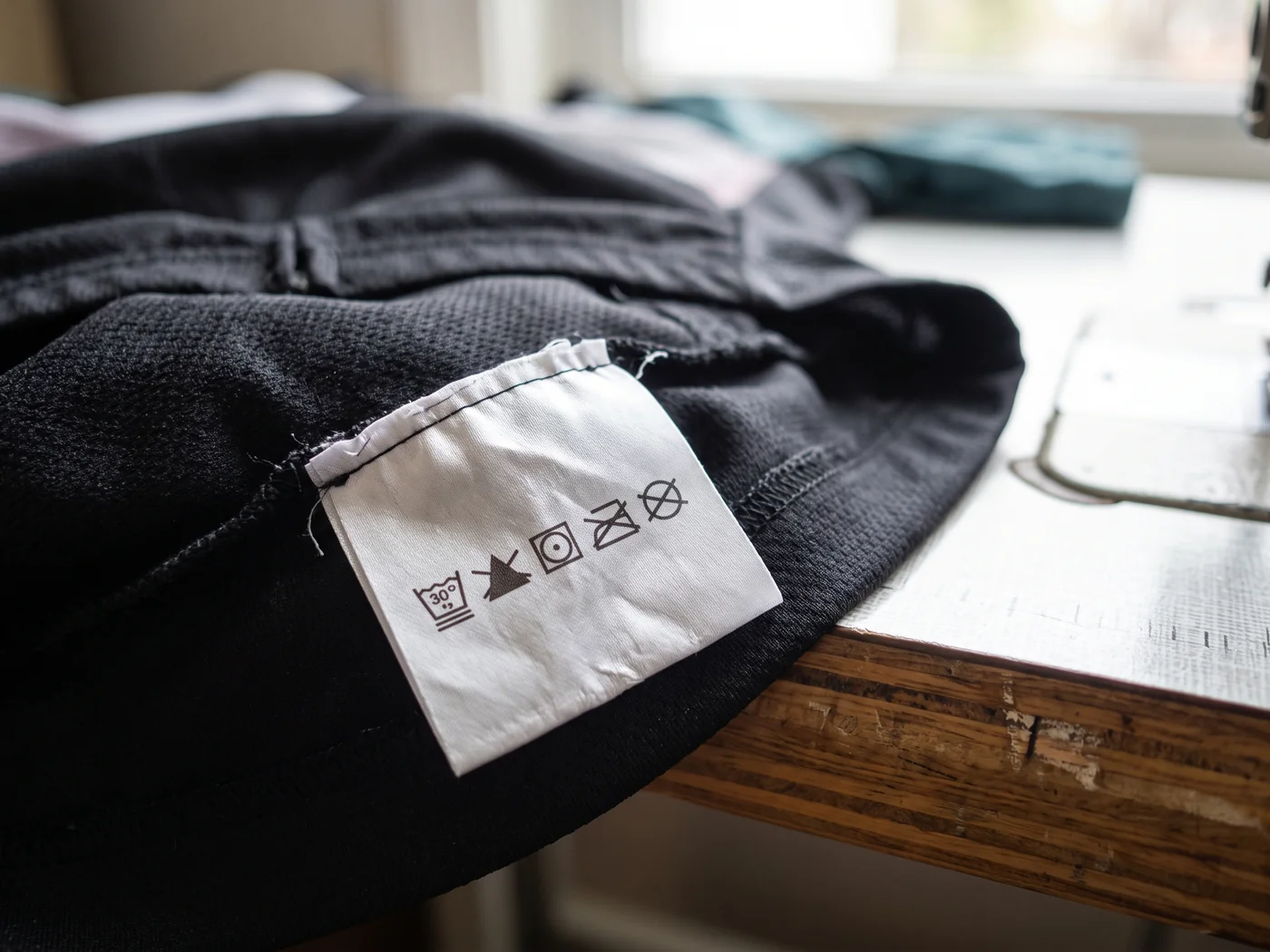
- Main label — the neck or hem label carrying your mark. It is a separate piece of artwork at a much smaller size, which means the version of your logo that works on a back panel usually will not work here. Simplified single-colour marks survive at label scale; detailed ones need a reduced variant, and that variant is a design decision worth making deliberately rather than by shrinking.
- Care and composition label — fibre content, care symbols, country of origin. This one is specified by you for your market, and we produce to what you specify. We do not provide legal or compliance advice and we do not obtain certifications on your behalf — if your market has a labelling rule, we need it as a specification, not as a question.
- Size label — separate from the care label in most retail-facing kits, integrated in most club kits. Which one you want is a choice, and it depends on whether these garments will ever sit on a shelf.
Where our responsibility stops. We produce labels to the wording and symbols you give us. Deciding what your market legally requires is yours or your compliance adviser's call — we will build exactly what the specification says, and we will ask for it in writing rather than guess at it.
If the garments will sit on a shelf, there is a longer list — hangtag, size card, individual poly bag, a barcode position with the code supplied by you. That list belongs to Bike Shops and Retailers.
One roster in
A Hundred Names Placed Once, Not a Hundred Times
Names and numbers are the one part of a kit where the artwork is different on every single garment. That is a layout problem, and it is solved before the first one is printed.
You send one roster. Every garment then carries a different string in the same position — and "the same position" is doing a lot of work in that sentence, because a nine-character surname and a four-character one are not the same object.
What Makes a Roster Layout Hold
| The variable | What goes wrong if it is placed per-garment | How it is handled |
|---|---|---|
| Name length | Long names get shrunk to fit, so the rack shows type at four different sizes | One type size for the whole roster, chosen so the longest name fits — then everyone matches |
| Number width | A single digit and a triple digit centre differently by eye | Numbers set in a fixed-width position, aligned on the position rather than on the glyph |
| Character set | Accented and non-Latin characters get dropped or substituted silently | The character set is confirmed against the roster before layout, not during production |
| Position | Each garment placed by hand drifts by a few millimetres, and drift is visible on a rack | One placement definition applied to every size, adjusted per size so it sits the same on the body |
The One That Surprises People: Placement Is Defined Per Size
A logo 80mm from the collar sits in a visibly different place on an XS than on a 3XL. Positions are set so they read the same on the rider, which means the numbers in the spec sheet differ between sizes on purpose.
Our size range runs XS–3XL with separate men's and women's blocks, and you can supply your own size chart instead.
Numbers Are Read From Behind, So Weight Matters More Than Style
The most common roster problem we correct is not a spelling error. It is a number set in too light a weight: it looks contemporary on screen and disappears from the wheel behind, which is the only place it actually needs to work.
We flag it at the layout stage and propose a heavier cut of the same face, because the alternative is a hundred garments that are technically correct and functionally useless.
Fabric prints the file. It cannot print what you meant.
- Artwork
- Layout
- Sample
- Confirmation
- Filed
Five Steps, and You Sign Off at Two of Them
The point of listing these is not the process. It is showing you exactly where you get to say no, and what it costs to say it there rather than later.
-
Step 1
Vector artwork
Whatever arrived becomes outlines. If it needed a redraw, the judgement calls come back listed.
You look, you don't sign yet.
-
Step 2
You sign off here
Placement layout
Artwork lands in the six zones, sized for the decoration method carrying it, with the sponsor hierarchy you gave us.
This is the cheapest place in the whole project to change your mind.
-
Step 3
Physical sample
Cut and made on your fabric, decorated the way production will be, with your confirmed colour reference.
Sampling runs 5–7 days.
-
Step 4
You sign off here
Sample confirmation
You check it against the layout you signed and the colour reference you confirmed. Changes here are normal: two rounds of sample revisions carry no additional sampling charge.
This signature is what bulk gets checked against.
-
Step 5
Filed
Confirmed pattern, spec sheet and colour reference are archived against your name and style.
The next order starts from a file instead of a conversation.
What the Clock Actually Looks Like
- A first reply lands within 24 business hours.
- A quote follows within 48 hours of a complete tech pack — a quote, on the commercial terms.
- Sampling runs 5–7 days; bulk runs 20–30 days from sample confirmation. Where a date is genuinely fixed, bulk can be compressed to 12–15 days with production scheduling agreed in advance.
What we deliberately don't promise here. We do not offer a set number of free visual revisions, and we do not promise a rendered visual within a fixed window.
The revision commitment we do make is the one in the sample confirmation step — two rounds on the physical sample — because that is the one that costs us something real and is therefore the one worth writing down. A promise about pictures is easy to make and impossible for you to hold us to.
How sampling itself works, and what a sample does and doesn't tell you, is on Sampling and Prototyping.
Two specific failures
Two Designs That Looked Right on a Monitor and Failed on Fabric
Not a general warning. Two specific things, both of which we have changed at the layout stage, and both of which you can check on your own artwork right now.
A monitor is backlit, perfectly flat, and shows you the artwork at whatever size you choose. Fabric is none of those. Two consequences come up often enough to be worth naming.
Small Light Type on a Dark Ground
On screen, pale type on a dark panel is high contrast and reads beautifully. On a dark stretch knit, the ink sits into a textured surface rather than on top of a flat one, and the fine gaps inside letters — the counters in an "a", the gap in an "e" — are the first thing to close up. The result is not "slightly softer". It is a word that has become a shape.
What we change: either the type goes up in size and weight, or that element moves to a light panel, or it changes decoration method to one that holds fine detail better. Which of the three depends on the zone it is in, which is why this conversation happens at layout and not at production.
Check it on your own file. Shrink your artwork on screen until the smallest text is about the height it will be on the garment, then look at it from across the room. That is roughly the honest preview — and it takes about fifteen seconds.
Hairline Strokes on an Open-Structure Fabric
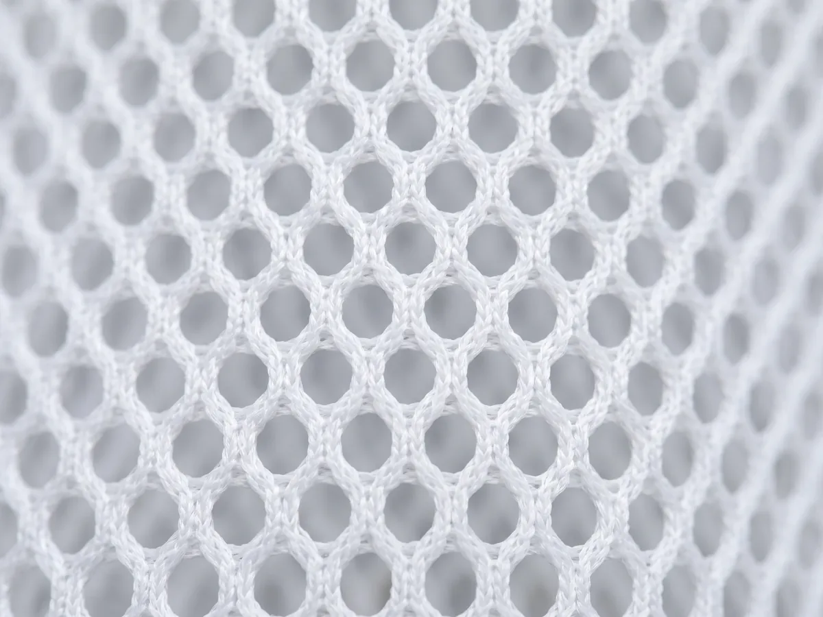
Lightweight summer jerseys use an open mesh in the panels that need airflow. A stroke thinner than the structure of the cloth does not print as a thin line — it prints as a broken line, because there is fabric missing underneath parts of it. Decorative hairlines, thin outlines around letters, and single-weight monoline logos are the usual casualties.
What we change: the stroke gets a floor, set by the fabric in that specific panel rather than by a global rule. The same logo can keep its hairline on the dense main body panel and need a heavier one on the mesh side panel — and if that inconsistency would bother you, it is better to know at layout that the two panels can't be identical.
Which decoration method does what — full-width sublimation, heat transfer, computerised embroidery, reflective print and heat-sealed reflective, silicone anti-slip — is on Printing Methods. What we cover here is only which design decisions those methods take off the table.
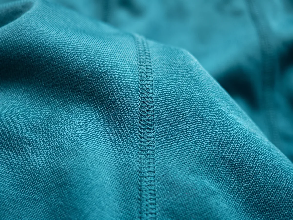
Stopped before cutting
Three Corrections We Make Most Often, Before Anything Is Cut
These are not hypothetical. They are the three notes that go back to buyers most weeks, and all three are cheaper to fix at layout than at any point after it.
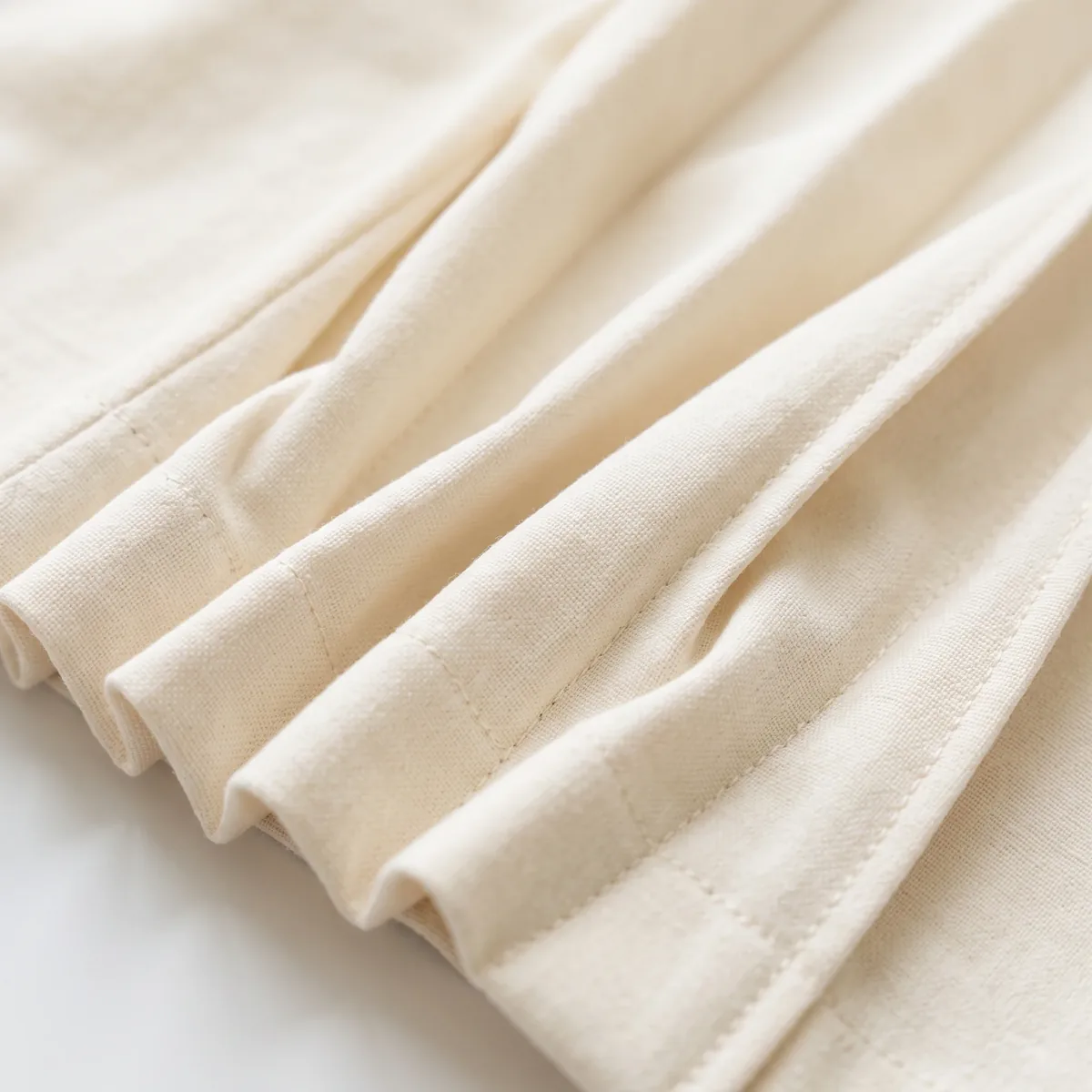
-
Two logos overlapping at the edges
When a sponsor block is laid out tightly, artwork gets nudged until two marks touch. Where they touch, two decoration passes land on the same fabric — and the overlap goes muddy, slightly stiff, and visibly different from either logo.
We separate them and send back the layout with the clearance marked, rather than printing a sample that shows you the problem. -
A back-panel graphic that ignores stretch
Artwork drawn on a flat rectangle and applied across the full back panel distorts once the panel is on a back that is rotated forward — most visibly, circles stop being circular across the shoulder blades.
We keep the elements that must hold their shape inside the stable band, and tell you which parts of the graphic will move. -
A reflective element sitting on a seam
Reflective print and reflective tape both need a continuous surface. Run one across a seam and it cracks at the seam line after wear, which reads as a manufacturing fault and is actually a layout decision.
We move it clear of the seam, or split it deliberately so the break is designed rather than accidental.
The Pattern in All Three
None of them are caught by looking at the artwork. They are caught by looking at the artwork on the garment, at the size it will be, on the panel it will sit on.
That is the whole reason the placement layout is a separate signature and not a formality.
The Layout Stage Is the Cheap Place to Change Your Mind
Send the Artwork and Colour References Send the artwork and the colour references, and the first thing back is a layout you can say no to.File requirements
Five Things That Make a File Printable, and What We Do When One Is Missing
This is the list you would get from any factory. The useful half is the last column — what happens when you don't have it, because most first-time buyers don't have all five.
The Five, and the Way Round Each One
| What we need | Why it has to be that way | If you don't have it |
|---|---|---|
| Outlines, not pixels | A jersey uses the same mark at 8mm on a label and 220mm on a back panel. Only outlines survive both | We redraw it, and send back the judgement calls we had to make |
| Type converted to outlines | A live font that isn't on our machine gets silently substituted — usually into something that looks almost right | Send the font or tell us the name, and we will confirm what we have before laying anything out |
| Bleed on anything reaching an edge | Panels are cut after decoration. Artwork that stops exactly at the panel edge shows a hairline of undecorated fabric | We extend it, and mark on the layout where we extended so you can check we did it the way you'd want |
| Colours named, not just shown | "The blue in the logo" is three different blues across three files. A named value plus your physical reference removes the argument | We pick the values off your best file, put them on a physical reference, and ask you to confirm the object rather than the number |
| A minimum size stated for each element | You know which elements must stay legible; we know what each decoration method can hold. The overlap is the answer | We propose one per element based on the zone and the method, and mark it for your sign-off |
-
The short version
A file that is missing all five is still a viable starting point. It costs a redraw and one extra round of confirmation. What it does not cost is the project — nobody gets turned away at this stage for the state of their artwork.
-
What it does cost, said plainly
Time at the front of the schedule, and your attention on the layout sign-off. A rebuilt file with five assumptions in it needs a real read, not a glance.
-
Where the artwork actually goes
Artwork and size lists go by email to [email protected]. The form on this page carries your details and your message. That is routing, not an apology: an email thread keeps the file and the conversation about the file in the same place.
Yours
The Files We Develop for You Are Not Used for Anyone Else
Two questions, and they have different answers depending on who drew it. Both answers are worth having in writing before you send anything.
- If you arrive with a complete tech pack — the original is yours, we keep one production copy to work from, and that copy is not authorised for any other buyer's order.
- If we develop the pattern and spec sheet from your concept or reference — once the sample is confirmed, the resulting tech pack is treated as your deliverable, with the same ownership as one you brought in yourself. We do not put one buyer's developed pattern on another buyer's order.
- Either way, the confirmed files stay on file here after the order ships, archived by buyer and by style — which is what makes a reorder or a new colourway start from a confirmed document instead of a new development cycle.
Why This Belongs on a Design Page Rather Than a Legal One
It is the reason the redraws and layouts above are worth doing properly. A rebuilt logo that gets reused elsewhere is not a service, it is a leak.
The full mechanics — how ownership is recorded, what happens on a private-label programme, what "archived" covers — are on OEM / ODM / Private Label Services.
Where to start
Where Clubs, Brands and Event Organisers Each Start
Same six zones, same five file requirements. Different first thing to sort out.
-
Clubs and teams
Sort out the sponsor hierarchy first. It is the only input we cannot supply and cannot guess, and it determines the whole back-panel layout.
Season management and reorders: Cycling Clubs and Teams -
Brands and DTC labels
Sort out the label set first — main label, care and composition, size — because that is what turns a garment into your product rather than a blank.
Private-label programmes: Cycling Brands and DTC Startups -
Event and corporate organisers
Sort out who signs off, and by when. Multiple parties approving artwork against a fixed date is a scheduling problem before it is a design one. On one regional gravel event's kit, a sponsor position was added late in the design stage and the delivery date still held — that order is described on Custom Gravel Cycling Apparel.
Approval timing against a fixed date: Cycling Events and Corporate Orders
Riding scenario changes the garment, not this process — road, gravel, mountain biking, commuting and triathlon each have their own page. Triathlon suits are a development and sampling capability here rather than a stock product line.
Asked before sending
Five Questions That Come Up Before Anyone Sends a File
Who owns the design once it's finished?
You do. If you brought the tech pack, the original stays yours and our copy is production-only. If we developed the pattern from your concept, the confirmed tech pack is your deliverable on the same terms. Either way it is never used on another buyer's order.
At what point is the design final?
At the placement layout sign-off, and then again at sample confirmation. Between those two, two rounds of sample revisions carry no additional sampling charge.
We don't offer a set number of free visual revisions — the commitment we make is on the physical sample, because that is the one that costs us something and is therefore worth relying on.
What does the sample confirmation actually involve?
A physical garment on your fabric, decorated the way production will be, checked against the layout you signed and the colour reference you confirmed. Sampling runs 5–7 days; bulk runs 20–30 days from the moment you confirm.
Can you work from our old kit instead of a file?
Yes — a garment is often a better reference than a soft file, because we can measure it and see how the decoration was done. Expect a redraw with the judgement calls listed, and expect us to ask you about one or two details the old garment answers ambiguously.
How many pieces do we need to order?
30 pieces per style per colour, with sizes freely mixed within that. Sample pieces sit outside it.
Send the Logo and the Colours, and the First Thing Back Is a Layout
A first reply lands within 24 business hours. A quote follows within 48 hours of a complete tech pack. If you don't have a tech pack, say so in the message and we will start from what you do have.
Tell us what you have
Every field below exists so the right person answers you first time. None of it is used to screen you out.Or reach us directly
- [email protected]
- Phone and WhatsApp
- +86 177 0272 7677
- Business hours
- Monday–Friday, 9:00–18:00 (GMT+8)
- Artwork and tech packs
- By email to sales@ — this form carries your details and your message only.
What comes in is read by the person who will run your layout, and it is not shown to anyone outside that.
We do not put one buyer's artwork, pattern or colour reference on another buyer's order — and that holds for whatever you send us before there is an order at all, including enquiries that never become one.
If you would rather check that in writing before sending anything, ask in the message box and we will put it in the reply.